The importance of button design
Research into User Experience (“U/X”) and interface design has often shown that the colour(s) and general appearance of vital Call To Action (“CTA”) on-screen components (notably buttons) can have a big impact on vital performance statistics, such as conversions and other goals you may have.
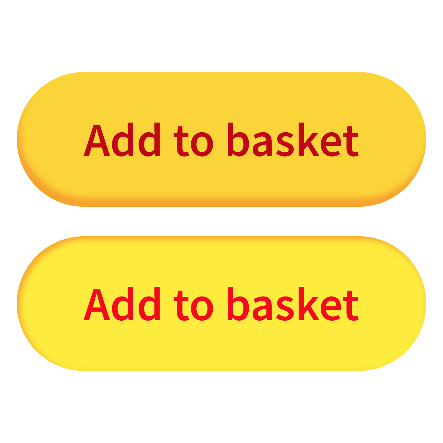
Over on one of my primary side-projects (The Soundtracks Shop) I’ve been putting this to the test – by carefully crafting new “Add to Basket” buttons – with plans for more such User Interface customisations to come.
The following (oversized!) image shows the default and “hover” states, up-close and in detail. They are purposefully bright (and hopefully cheerful..) – to not only fit in with the established framework of soundtracks.shop – but also to be sure to attract the attention of the Customer/User.
What do you think..?